How to Read a Research Table
The tables in this section present the research findings that drive many recommendations and standards of practice related to breast cancer.
Research tables are useful for presenting data. They show a lot of information in a simple format, but they can be hard to understand if you don’t work with them every day.
Here, we describe some basic concepts that may help you read and understand research tables. The sample table below gives examples.
The numbered table items are described below. You will see many of these items in all of the tables.
Sample table – Alcohol and breast cancer risk
|
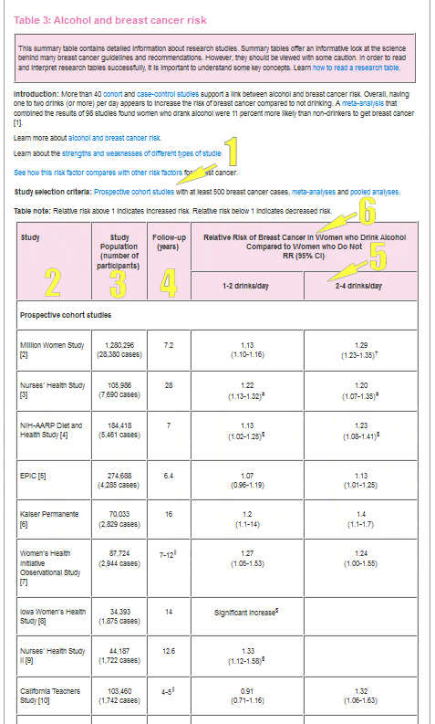

Selection criteria
Studies vary in how well they help answer scientific questions. When reviewing the research on a topic, it’s important to recognize “good” studies. Good studies are well-designed.
Most scientific reviews set standards for the studies they include. These standards are called “selection criteria” and are listed for each table in this section. These selection criteria help make sure well-designed studies are included in the table.
Types of studies
The types of studies (for example, randomized controlled trial, prospective cohort, case-control) included in each table are listed in the selection criteria.
Learn about the strengths and weaknesses of different types of research studies.
Study size
Selection criteria for most tables include the minimum number of cases of breast cancer or participants for the studies in the table.
Large studies have more statistical power than small studies. This means the results from large studies are less likely to be due to chance than results from small studies.
The power of large numbers
You can see the power of large numbers if you think about flipping a coin. Say you are trying to figure out whether a coin is fixed so that it lands on “heads” more than “tails.” A fair coin would land on heads half the time. So, you want to test whether the coin lands on heads more than half of the time.
If you flip the coin twice and get 2 heads, you don’t have a lot of evidence. It wouldn’t be surprising to flip a fair coin and get 2 heads in a row. With 2 coin flips, you can’t be sure whether you have a fair coin or not. Even 3 or 4 heads in a row wouldn’t be surprising for a fair coin.
If, however, you flipped the coin 20 times and got mostly heads, you would start to think the coin might be fixed.
With an increasing number of observations, you have more evidence on which to base your conclusions. So, you have more confidence in your conclusions. It’s a similar idea in research.
Example of study size in breast cancer research
Say you’re interested in finding out whether or not alcohol use increases the risk of breast cancer.
If there are only a few cases of breast cancer among the alcohol drinkers and the non-drinkers, you won’t have much confidence drawing conclusions.
If, however, there are hundreds of breast cancer cases, it’s easier to draw firm conclusions about a link between alcohol and breast cancer. With more evidence, you have more confidence in your findings.
The importance of study design and study quality
Study design (the type of research study) and study quality are also important. For example, a small, well-designed study may be better than a large, poorly-designed study. However, when all else is equal, a larger number of people in a study means the study is better able to answer research questions.
Learn about different types of research studies.

The studies
The first column (from the left) lists either the name of the study or the name of the first author of the published article.
Below each table, there’s a reference list so you can find the original published articles.
Sometimes, a table will report the results of only one analysis. This can occur for a few reasons. Either there’s only one study that meets the selection criteria or there’s a report that combines data from many studies into one large analysis.

Study population
The second column describes the people in each study.
- For randomized controlled trials, the study population is the total number of people who were randomized at the start of the study to either the treatment (or intervention) group or the control group.
- For prospective cohort studies, the study population is the number of people at the start of the study (baseline cohort).
- For case-control studies, the study population is the number of cases and the number of controls.
In some tables, more details on the people in the study are included.

Length of follow-up
Randomized controlled trials and prospective cohort studies follow people forward in time to see who will have the outcome of interest (such as breast cancer).
For these studies, one column shows the length of follow-up time. This is the number or months or years people in the study were followed.
Because case-control studies don’t follow people forward in time, there are no data on follow-up time for these studies.
Tables that focus on cumulative risk may also show the length of follow-up. These tables give the length of time, or age range, used to compute cumulative risk (for example, the cumulative risk of breast cancer up to age 70).
Learn more about cumulative risk.

Other information
Some tables have columns with other information on the study population or the topic being studied. For example, the table Exercise and Breast Cancer Risk has a column with the comparisons of exercise used in the studies.
This extra information gives more details about the studies and shows how the studies are similar to (and different from) each other.
Studies on the same topic can differ in important ways. They may define “high” and “low” levels of a risk factor differently. Studies may look at outcomes among women of different ages or menopausal status.
These differences are important to keep in mind when you review the findings in a table. They may help explain differences in study findings.

Understanding the numbers
All of the information in the tables is important, but the main purpose of the tables is to present the numbers that show the risk, survival or other measures for each topic. These numbers are shown in the remaining columns of the tables.
The headings of the columns tell you what the numbers represent. For example:
- What is the outcome of interest? Is it breast cancer? Is it 5-year survival? Is it breast cancer recurrence?
- Are groups being compared to each other? If so, what groups are being compared?
Relative risks
Most often, findings are reported as relative risks. A relative risk shows how much higher, how much lower or whether there’s no difference in risk for people with a certain risk factor compared to the risk in people without the factor.
A relative risk compares 2 absolute risks.
- The numerator (the top number in a fraction) is the absolute risk among people with the risk factor.
- The denominator (the bottom number) is the absolute risk among those without the risk factor.
The absolute risk of those with the factor divided by the absolute risk of those without the factor gives the relative risk.
|
When relative risk is: | This shows: |
Greater than 1 | People with the risk factor have a higher risk than people without the risk factor. A relative risk of 1.5 means someone with the risk factor has a 50 percent higher risk of breast cancer than someone without the factor. A relative risk of 2.0 means someone with the risk factor has twice the risk (or 2-fold the risk) of someone without the factor. |
Less than 1 | People with the risk factor have a lower risk than people without the risk factor. A relative risk of 0.8 means someone with the risk factor has a 20 percent lower risk of breast cancer than someone without the factor. |
1 | A relative risk of 1 means there’s no difference in risk between people with and without the risk factor. |
The confidence interval around a relative risk helps show whether or not the relative risk is statistically significant (whether or not the finding is likely due to chance).
Learn more about confidence intervals.
Example of relative risk
Say a study shows women who don’t exercise (inactive women) have a 25 percent increase in breast cancer risk compared to women who do exercise (active women).
This statistic is a relative risk (the relative risk is 1.25). It means the inactive women were 25 percent more likely to develop breast cancer than women who exercised.
Learn more about relative risk.
Confidence intervals
A 95 percent confidence interval (95% CI) around a risk measure means there’s a 95 percent chance the “true” measure falls within the interval.
Because there’s random error in studies, and study populations are only samples of much larger populations, a single study doesn’t give the “one” correct answer. There’s always a range of likely answers. A single study gives a “best estimate” along with a 95 % CI of a likely range.
Most scientific studies report risk measures, such as relative risks, odds ratios and averages, with 95% CI.
Confidence intervals and statistical significance
For relative risks and odds ratios, a 95% CI that includes the number 1.0 means there’s no link between an exposure (such as a risk factor or a treatment) and an outcome (such as breast cancer or survival).
When this happens, the results are not statistically significant. This means any link between the exposure and outcome is likely due to chance.
If a 95% CI does not include 1.0, the results are statistically significant. This means there’s likely a true link between an exposure and an outcome.
Examples of confidence intervals
A few examples from the sample table above may help explain statistical significance.
The EPIC study found a relative risk of breast cancer of 1.07, with a 95% CI of 0.96 to 1.19. In the table, you will see 1.07 (0.96-1.19).
Women in the EPIC study who drank 1-2 drinks per day had a 7 percent higher risk of breast cancer than women who did not drink alcohol. The 95% CI of 0.96 to 1.19 includes 1.0. This means these results are not statistically significant and the increased risk of breast cancer is likely due to chance.
The Million Women’s Study found a relative risk of breast cancer of 1.13 with a 95% CI of 1.10 to 1.16. This is shown as 1.13 (1.10-1.16) in the table.
Women in the Million Women’s Study who drank 1-2 drinks per day had a 13 percent higher risk of breast cancer than women who did not drink alcohol. In this case, the 95% CI of 1.10 to 1.16 does not include 1.0. So, these results are statistically significant and suggest there’s likely a true link between alcohol and breast cancer.
For any topic, it’s important to look at the findings as a whole. In the sample table above, most studies show a statistically significant increase in risk among women who drink alcohol compared to women who don’t drink alcohol. Thus, the findings as a whole suggest alcohol increases the risk of breast cancer.
Summary relative risks
Summary relative risks from meta-analyses
A meta-analysis takes relative risks reported in different studies and “averages” them to come up with a single, summary measure. Findings from a meta-analysis can give stronger conclusions than findings from a single study.
Summary relative risks from pooled analyses
A pooled analysis uses data from multiple studies to give a summary measure. It combines the data from each person in each of the studies into one large data set and analyses the data as if it were one big study. A pooled analysis is almost always better than a meta-analysis.
In a meta-analysis, researchers combine the results from different studies. In a pooled analysis, researchers combine the individual data from the different studies. This usually gives more statistical power than a meta-analyses. More statistical power means it’s more likely the results are not simply due to chance.
Cumulative risk
Sometimes, study findings are presented as a cumulative risk (risk up to a certain age). This risk is often shown as a percentage.
A cumulative risk may show the risk of breast cancer for a certain group of people up to a certain age. Say the cumulative risk up to age 70 for women with a risk factor is 20 percent. This means by age 70, 20 percent of the women (or 1 in 5) with the risk factor will get breast cancer.
Lifetime risk is a cumulative risk. It shows the risk of getting breast cancer during your lifetime (or up to a certain age). Women in the U.S. have a 13 percent lifetime risk of getting breast cancer. This means 1 in 8 women in the U.S. will get breast cancer during their lifetime.
Learn more about lifetime risk.
Sensitivity and specificity
Some tables show study findings on the sensitivity and specificity of screening tests. These measures describe the quality of a breast cancer screening test.
- Sensitivity shows how well the screening test shows who truly has breast cancer. A sensitivity of 90 percent means 90 percent of people tested who truly have breast cancer are correctly identified as having cancer.
- Specificity shows how well the screening test shows who truly does not have breast cancer. A specificity of 90 percent means 90 percent of the people who do not have breast cancer are correctly identified as not having cancer.
The goals of any screening test are:
- To correctly identify everyone who has a certain disease (100 percent sensitivity)
- To correctly identify everyone who does not have the disease (100 percent specificity)
A perfect test would correctly identify everyone with no mistakes. There would be no:
- False negatives (when people who have the disease are missed by the test)
- False positives (when healthy people are incorrectly shown to have the disease)
No screening test has perfect (100 percent) sensitivity and perfect (100 percent) specificity. There’s always a trade-off between the two. When a test gains sensitivity, it loses some specificity.
Learn more about sensitivity and specificity.
Finding studies
You may want more detail about a study than is given in the summary table. To help you find this information, the references for all the studies in a table are listed below the table.
Each reference includes the:
- Authors of the study article
- Title of the article
- Year the article was published
- Title and specific issue of the medical journal where the article appeared
PubMed, the National Library of Medicine’s search engine, is a good source for finding summaries of science and medical journal articles (called abstracts).
For some abstracts, PubMed also has links to the full text articles. Most medical journals have websites and offer their articles either for free or for a fee.
If you live near a university with a medical school or public health school, you may be able to go to the school’s medical library to get a copy of an article. Local public libraries may not carry medical journals, but they may be able to find a copy of an article from another source.
More information on research studies
If you’re interested in learning more about health research, a basic epidemiology textbook may be a good place to start. The National Cancer Institute also has information on epidemiology studies and randomized controlled trials.
Updated 07/25/22
TOOLS & RESOURCES
In Your Own Words
How has having breast cancer changed your outlook?